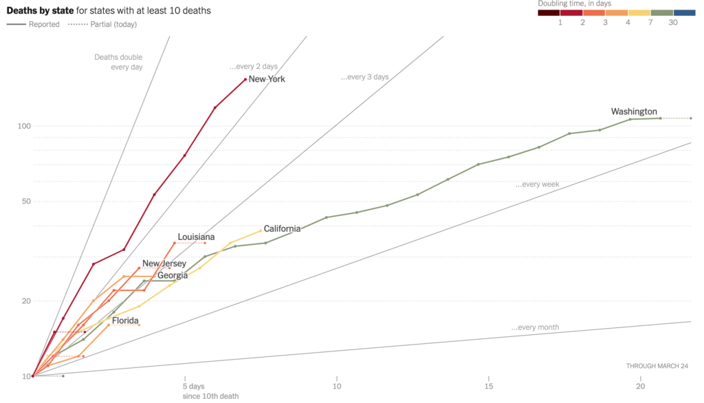
A good, evidence-based chart brings clarity to complex situations. The New York Times frequently finds that sweet spot.
Click through to the interactive version of this chart, being updated daily, on the NYTimes website.


https://www.nytimes.com/interactive/2020/03/21/upshot/coronavirus-deaths-by-country.html